" height="810px" id="u9jgqp_wt" width="900px"/></svg>)


4x Design Award Winner
PIA
Master's Project
•
Group
•
Design Concept
•
2021
PIA is a data-rich conversational assistant designed for airports and air travelers, helping address the unique and struggles and needs involved in getting from your home to your final destination.
I designed PIA alongside Youngryun Cho, Devika Pillai, and Wei-Chieh Wang over eight weeks of a Master's studio course at the Carnegie Mellon School of Design. We delivered research materials, UX materials, mobile & kiosk UI designs, a design concept pitch video, and a presentation to faculty and students. My role included research, concept development, brand design, motion graphics, and UX/UI design.
PIA has been granted design awards from Core77, iF Design, the HCI International, and Red Dot.
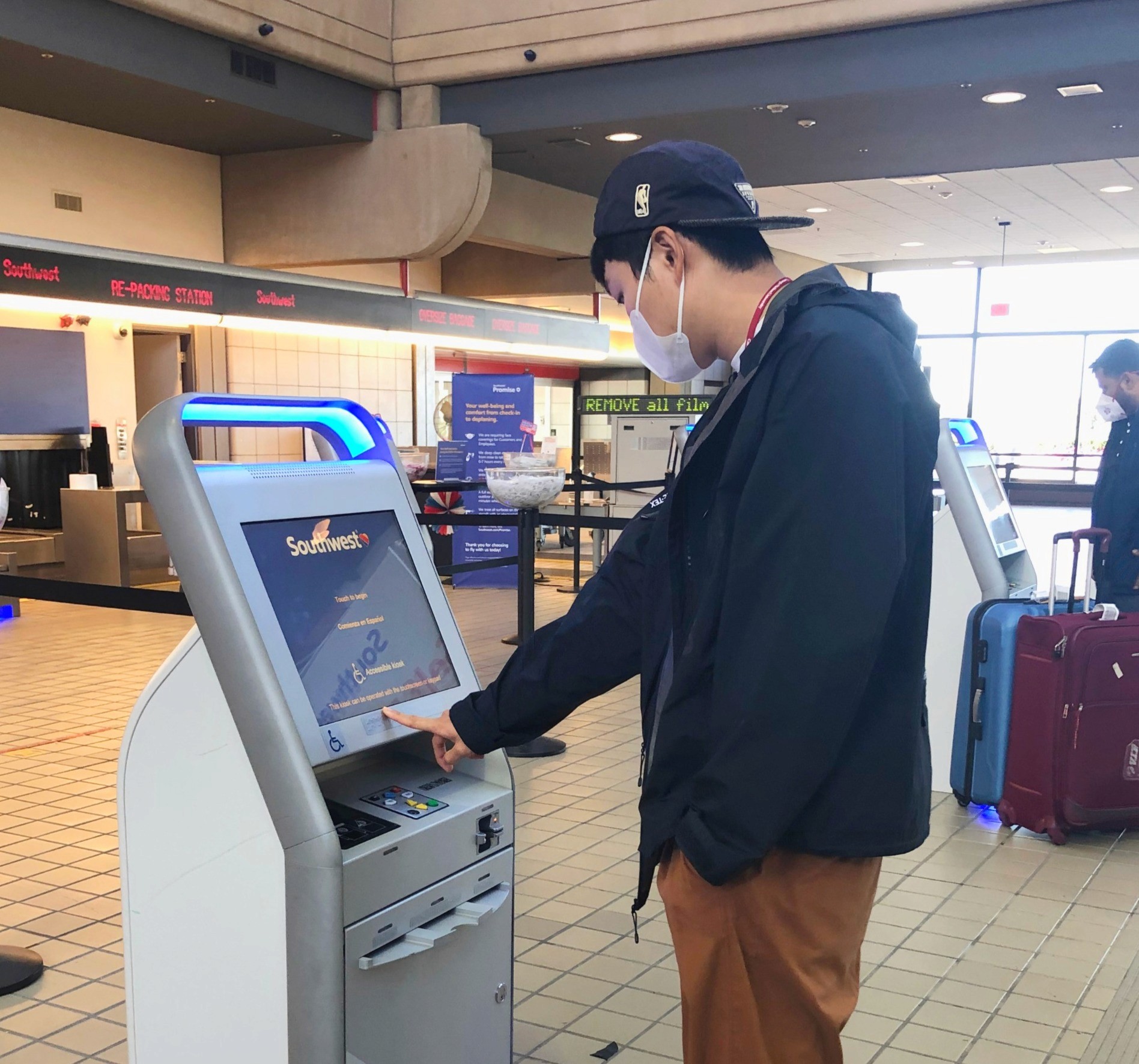
Even the most experienced travelers and the most refined itineraries are exposed to the risk of calamity. Travelers moving through Pittsburgh’s airport have little resources available to keep on schedule, get where they're going, and figure out what to do in the case of a delay or cancellation. The airport has an extremely basic mobile app and on-site kiosks include only airline check-in software.
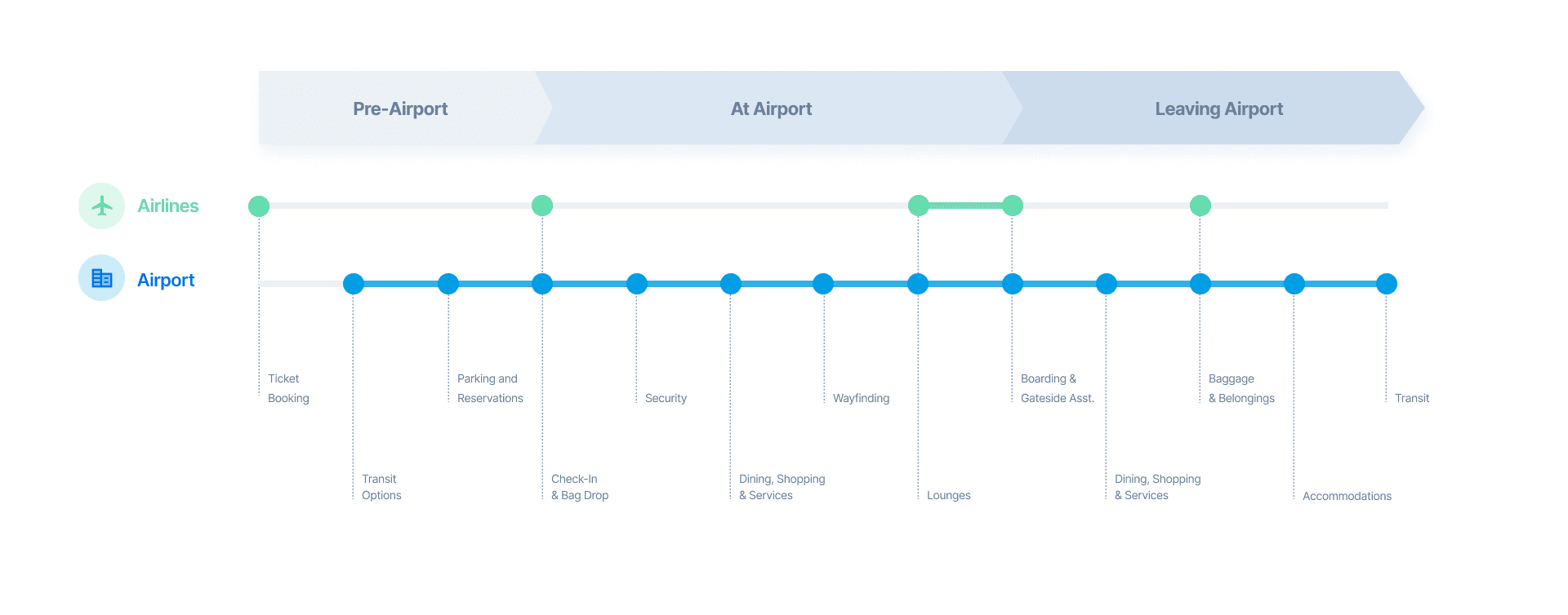
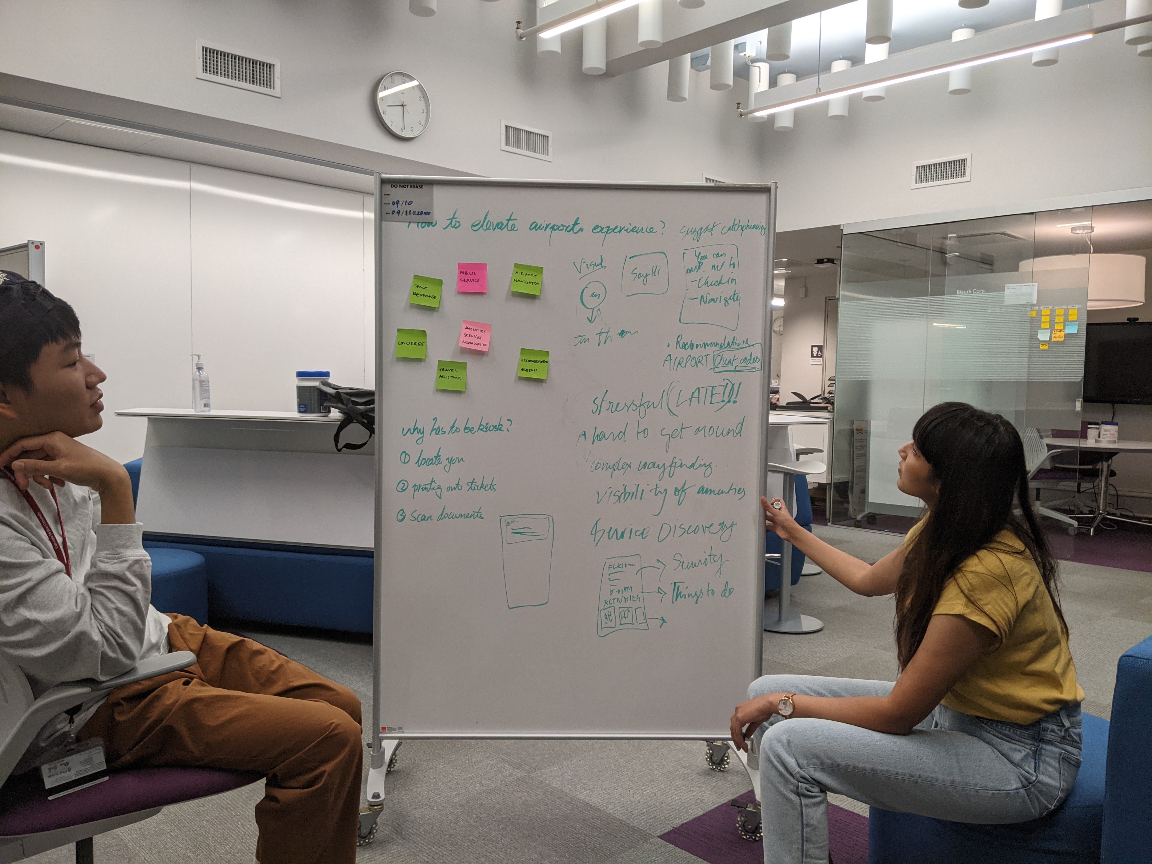
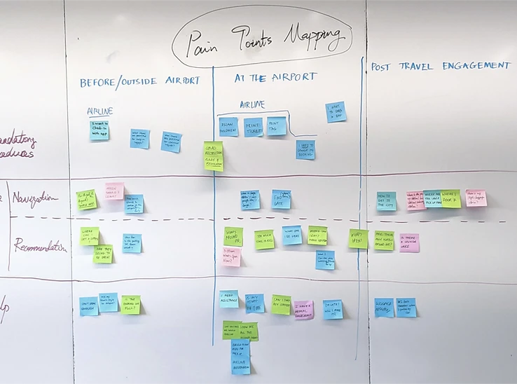
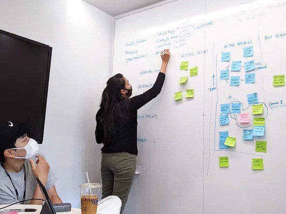
We used site visits, interviews, and secondary research to map user journeys to find opportunity in the emotions, needs, and interactions of travelers going to, from, and through Pittsburgh International. We identified and mapped pain points for experiences before the airport, at the airport, and for post-travel engagement.

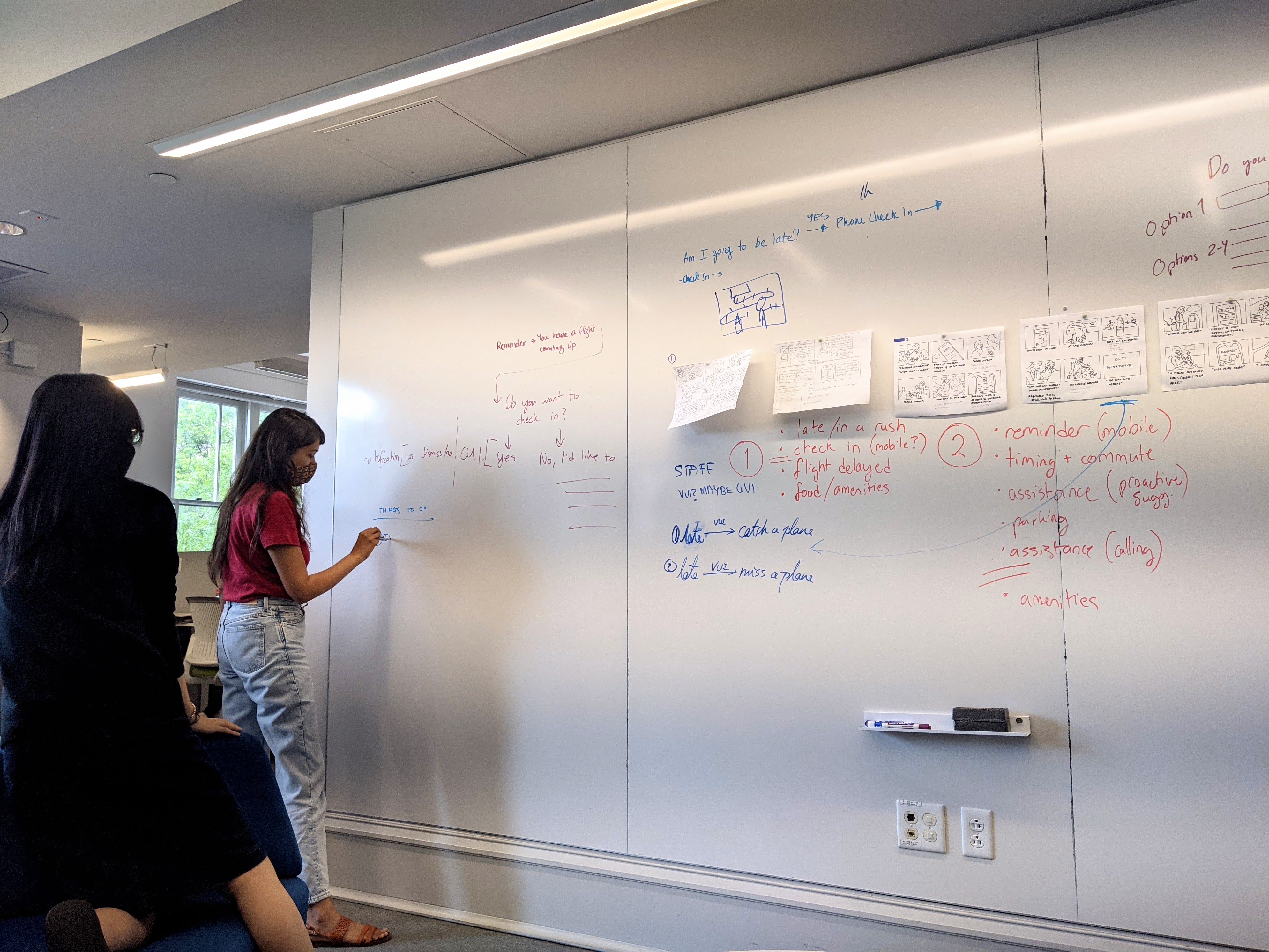
We storyboarded situations to play out how particular traveler profiles could experience pain point scenarios we had identified, in order to theory-test solutions:
A local frequent-flier familiar who experiences a delay after getting to the airport;
a local family flying with children and an elderly parent; and
an international passenger who's never been to Pittsburgh and needs to get into town after landing at night.

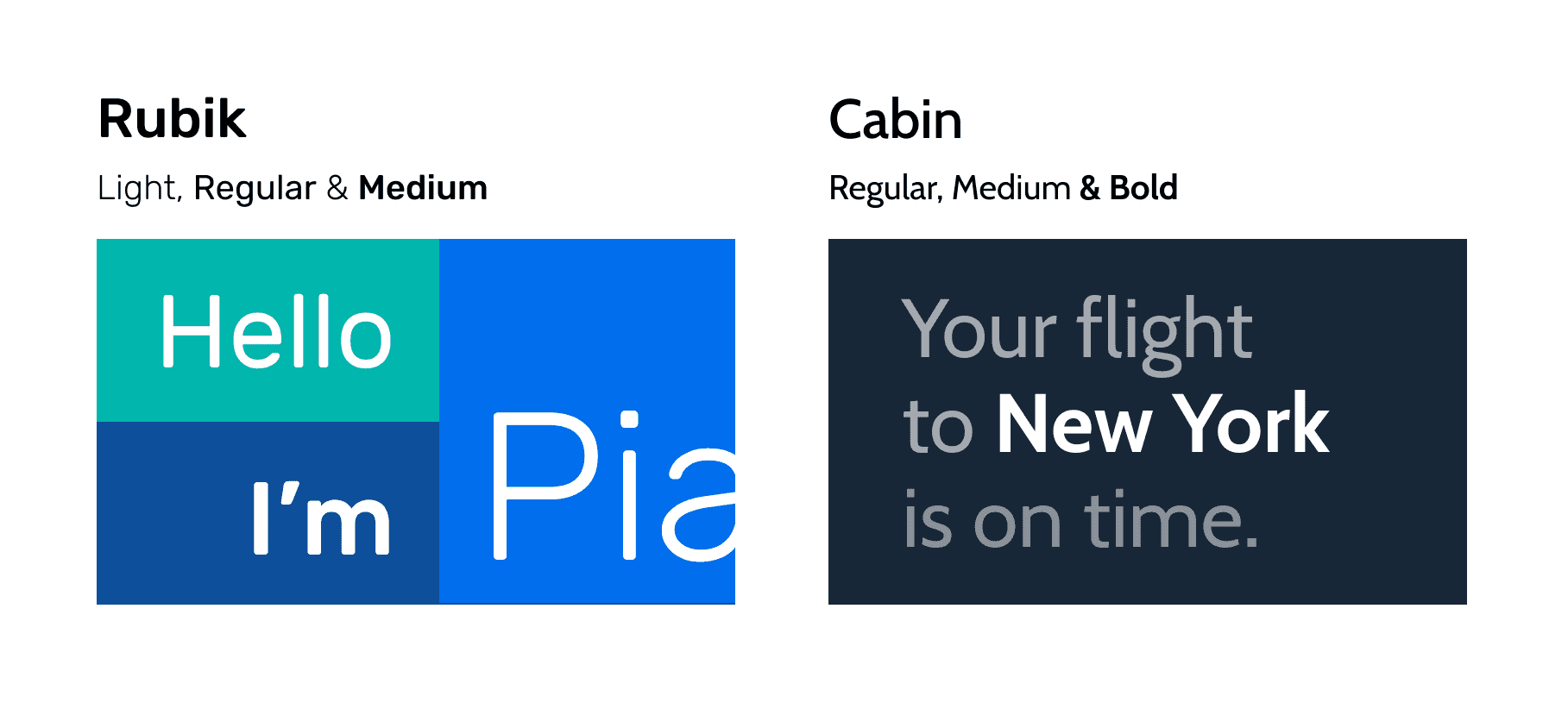
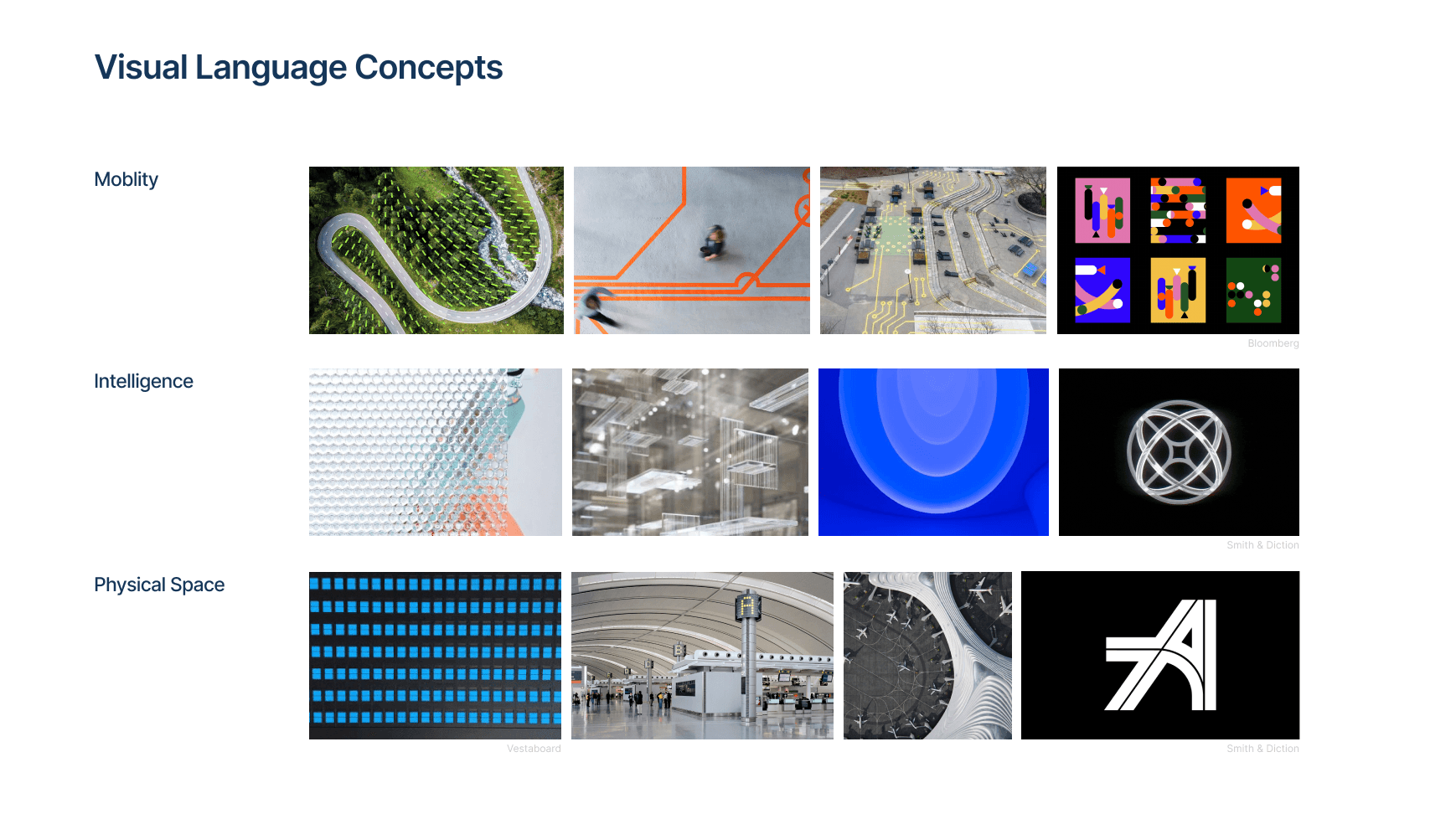
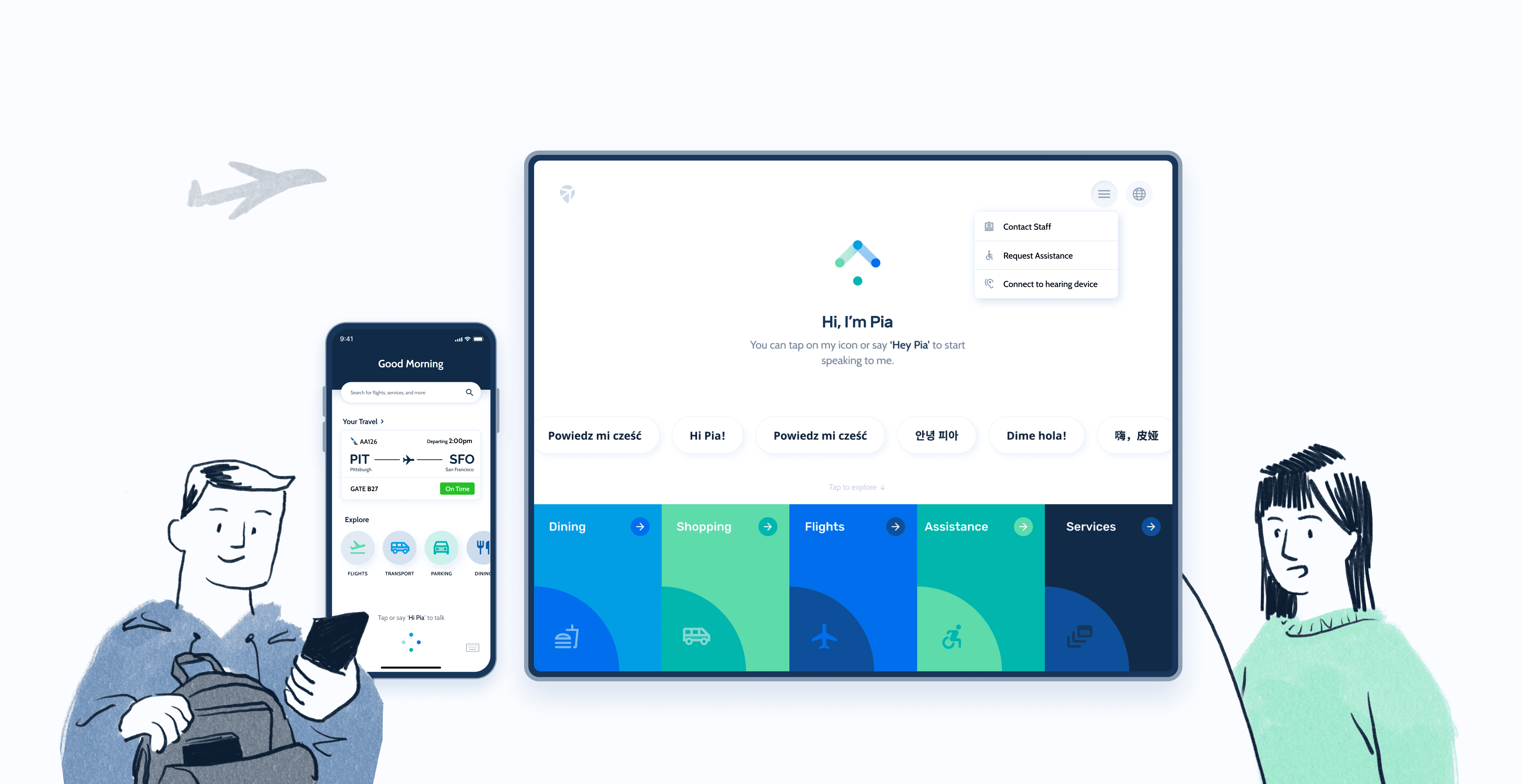
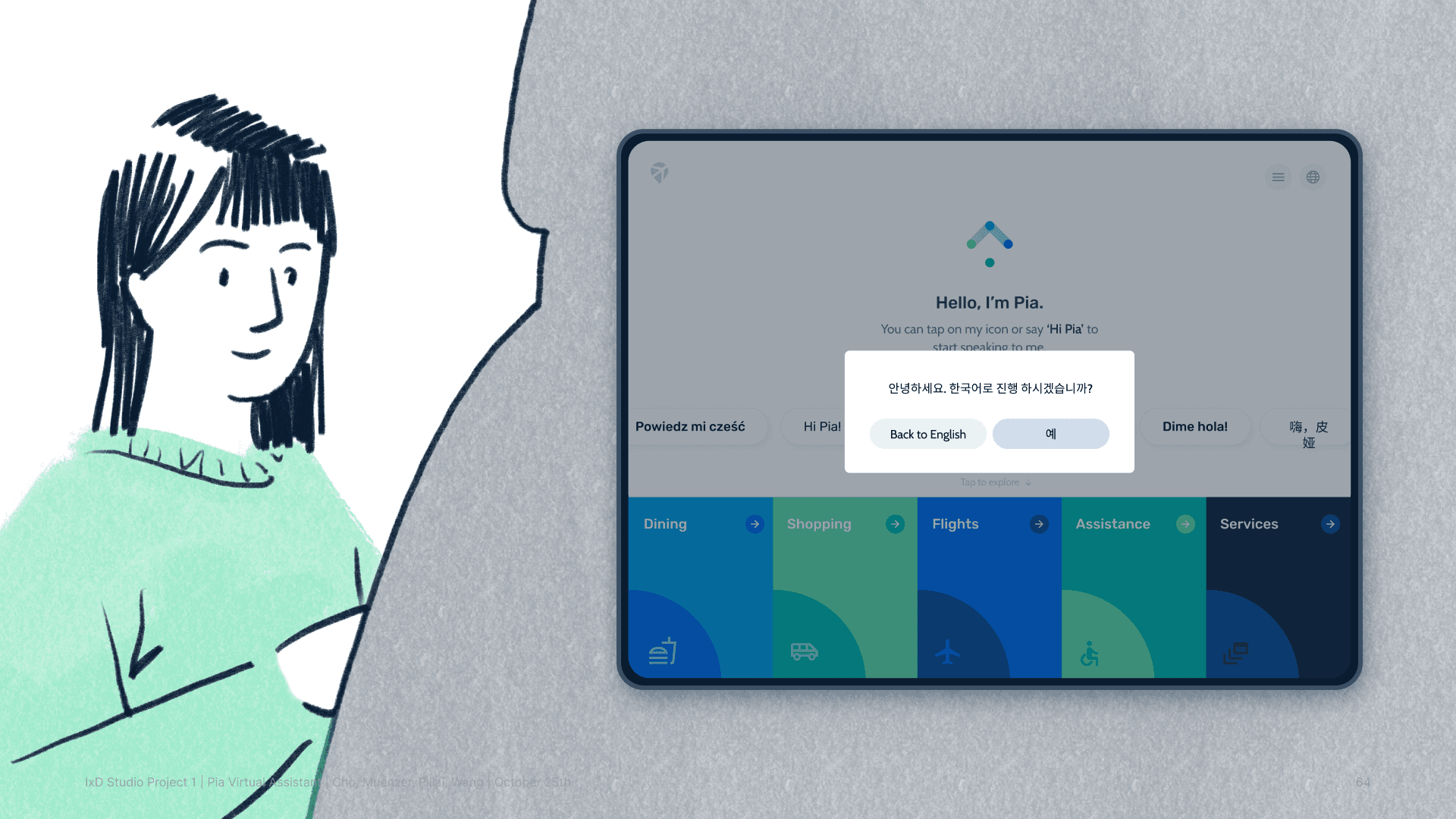
When it came time to give PIA a form and identity, we decided that an assistant supporting air travel and in the aviation space should be different from one you might find elsewhere, such as in a restaurant or a school—we wanted Pia to act and feel like it belonged to an airport, with the directness and sophistication to match.
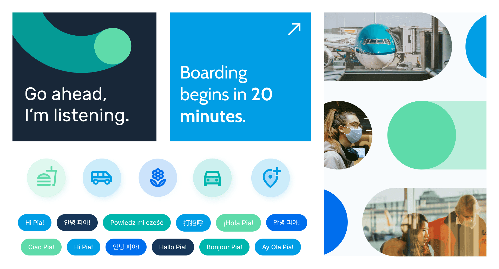
Our visual concept for PIA was four connected dots—connected nodes with lines of shifting color fluidly pouring in and out. To resonate with modern air travel, we made Pia's motion fluid, agile, and light.
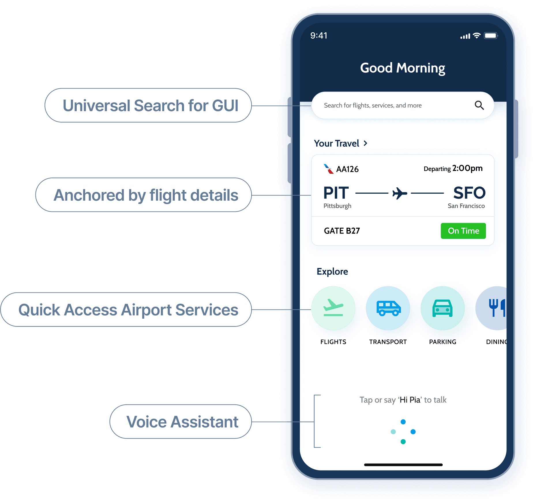
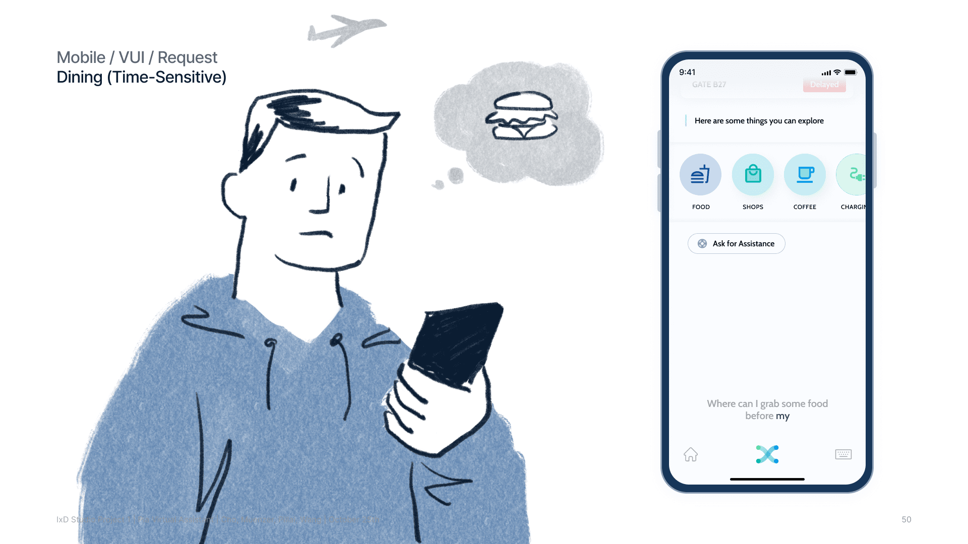
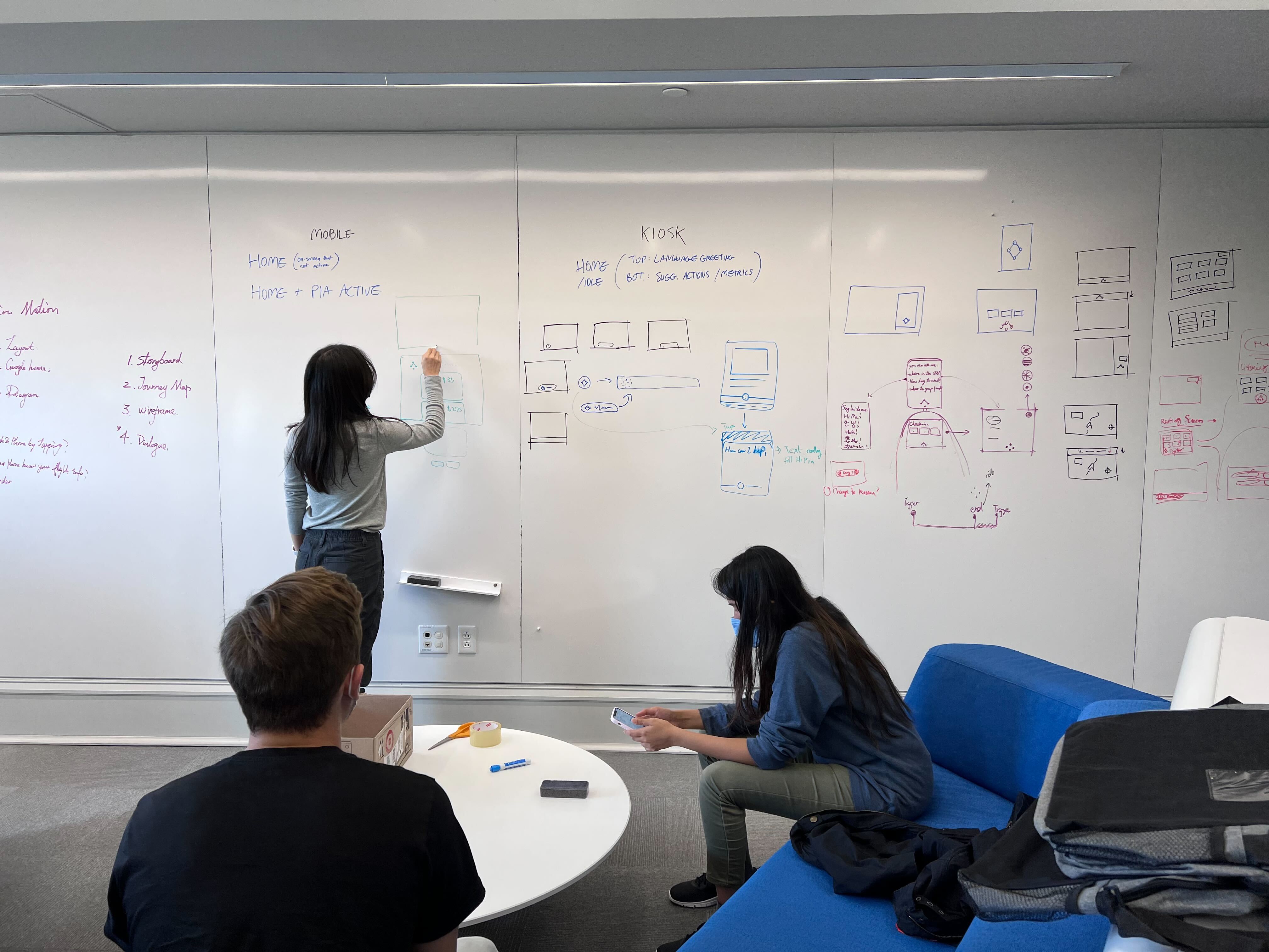
We redesigned an existing Pittsburgh International Airport app (mostly a directory of services). We gave PIA a home in a bottom navigation bar, providing balanced access between GUI and VUI interactions.
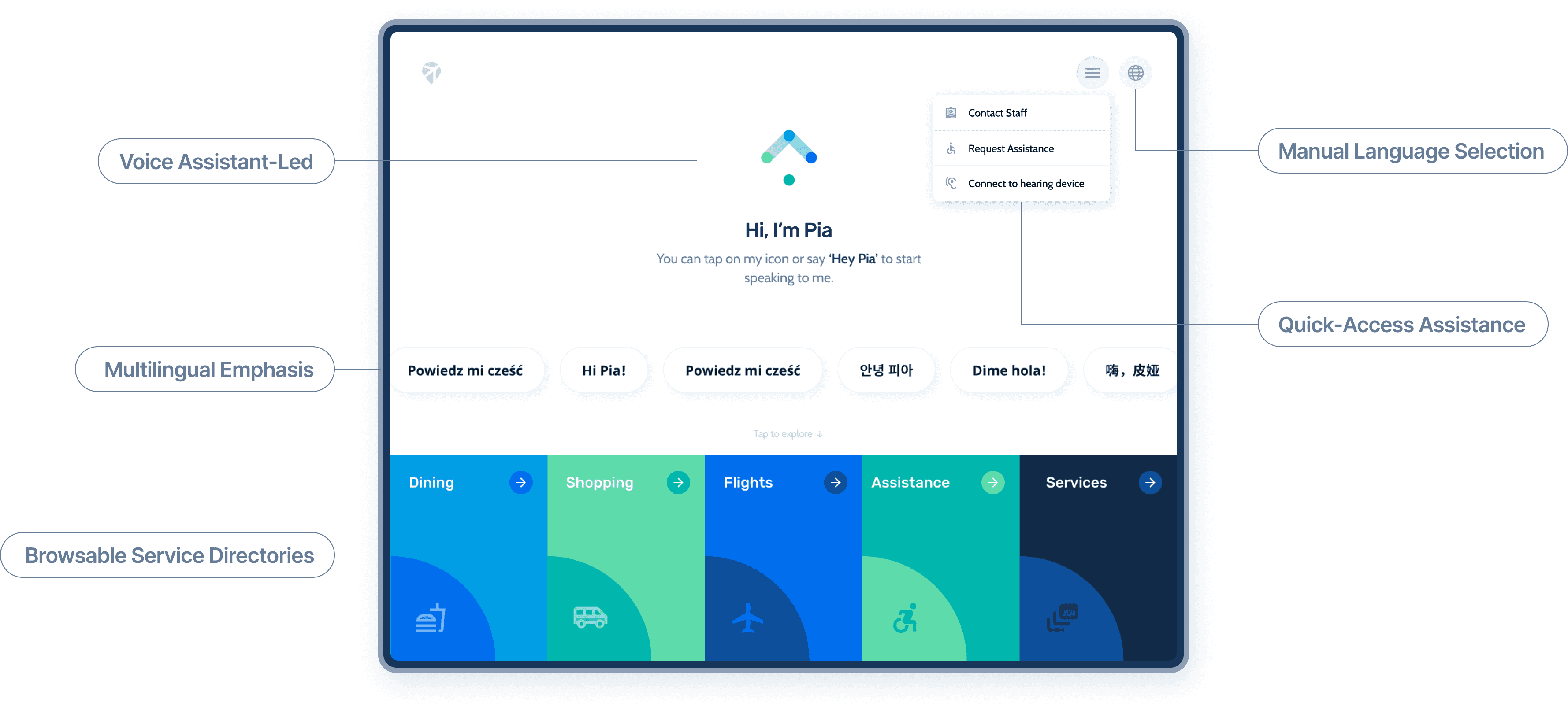
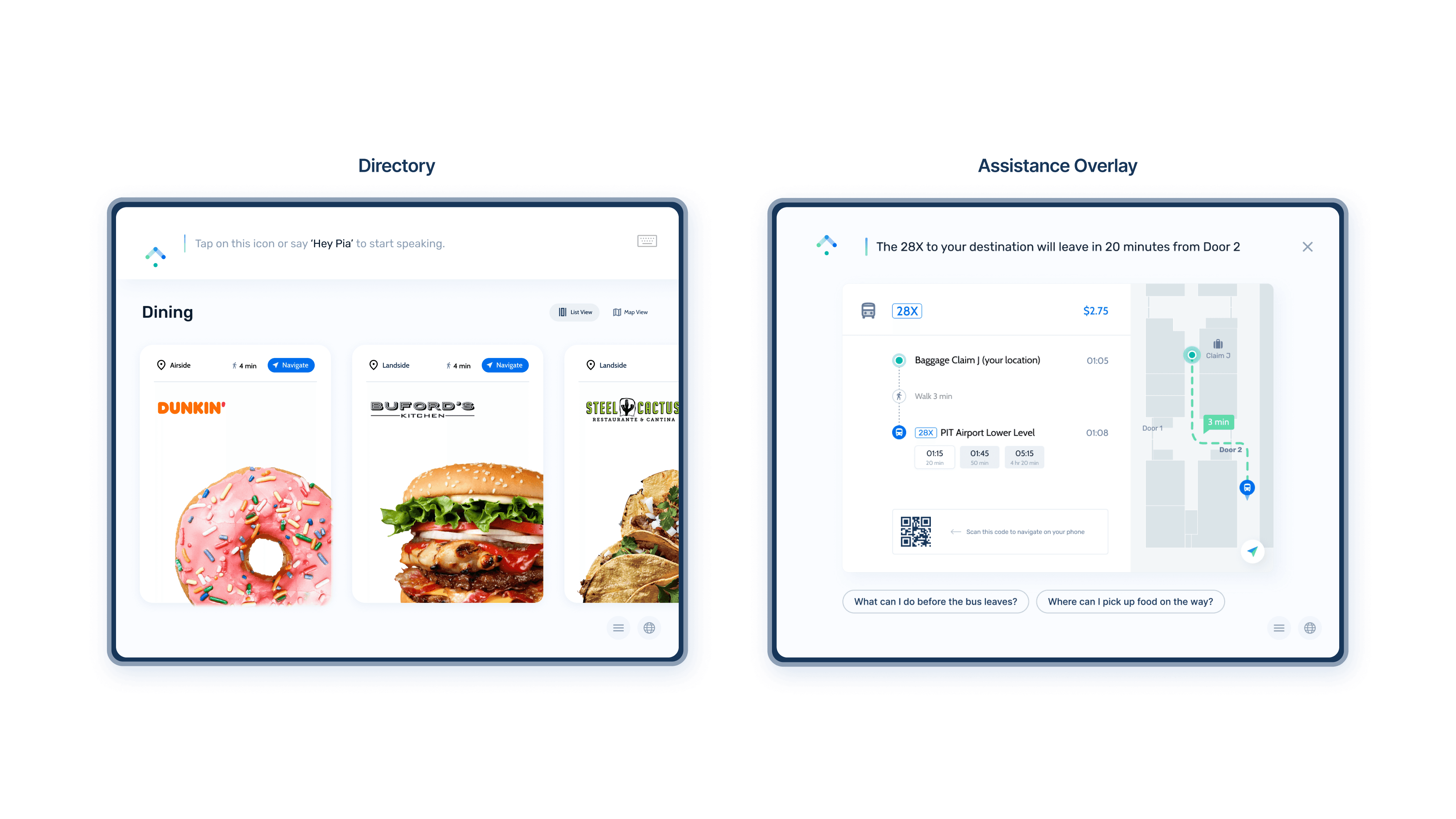
The Pittsburgh airport has on-site touch-screen kiosks, but they have no features beyond check-in and boarding pass printing. We designed a new multilingual software system for these kiosks in tandem with the mobile UX. These interfaces take advantage of untapped kiosk hardware, including accent lights, cameras, microphones, barcode readers, and scanners to provide sorely-needed assistance features for travelers, even without the app.
This site was designed in Figma and made in Framer without templates or purchases. Motion graphics made using Jitter.